This week as with every first week of a new month we have an image and you have to pick out a minimum of three elements to design your card with.
These elements could be anything at all but each can only be one thing, for example the colour can only be one - you can't separate them into individual colours. The layout of the image may be another and Kathy has drawn up a sketch for us from the image so you can use that too. I've added the sketch underneath the image:
Layout Sketch:
There's lots and lots in the image to pick out. I particularly like the paint marks and the doodles in the background which I can see as stamped images over watercolour marks. The inky numbers could be picked out for a birthday card design too and the lotus flowers would also make a pretty individual element. There's so much here I bet you can use more than three too!
Here's what the design team have come up with this week, have fun!
x Leo
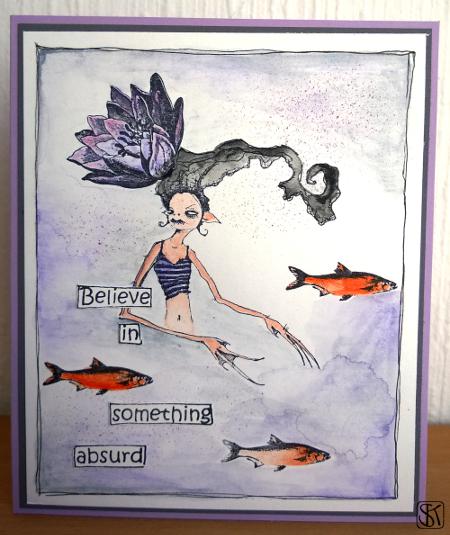
Mark making : long hair : colours : paint : line drawing
Image of girl and long hair : Flowers : Pink Spots : Numbers
Image of girl : Dots : Stripes
Colours : Flowers : Layout sketch
Colours : Old Paper : Painting : Line drawings


1 comment :
Amazing creations from you all!! Smiles.xx
Post a Comment